

Introduction
Why WordPress is Perfect for Educational Websites
Before we dive into the examples, let’s quickly cover why WordPress is ideal for educational sites:
- Easy to manage: Even non-technical users can update content.
- Flexible design: Choose from thousands of education-focused themes.
- Powerful plugins: Tools like LearnDash, Tutor LMS, and MemberPress turn any site into a full online school.
- SEO-friendly: Helps educational institutions rank higher on Google.
- Affordable: You can build anything from a simple school site to a full e-learning platform at a lower cost.
9 Best Educational Websites That Built-in WordPress
1. Harvard Gazette

2. Skillcrush

The next website we want to put in the highlight is Skillscrush. Skillcrush offers people job-training programs for all kinds of web-related careers. From freelance WordPress developer to visual designer, web designer and web developer. Their website uses a nice balance of fresh colors, illustrations and real-life pictures. Skillcrush is the ideal example of what a user-friendly website looks like nowadays. In contrary to university websites, this type of educational website focuses more on the commercial side of their business. They, for instance, offer an e-book to attract customers. Something you wouldn’t often see at websites that are dedicated to universities and colleges.
3. Georgia State University

Georgia State University is the website that comes next on our list of educational websites that use WordPress. One thing you’ll notice about their website is the dominant professional blue hue used in their logo. They decided to consistently utilize that same colour over their entire website. The major menu comprises seven basic menu items that reflect the core of the university.
4. The Round Rock
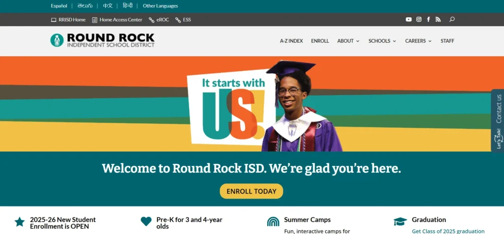
The Round Rock Independent School District in Texas, USA, has an impressive collection of school websites. For ease of use and consistency, they have a set-up where all their school websites are a similar design, yet are customized to reflect the individuality of each school.
5. Washington State University
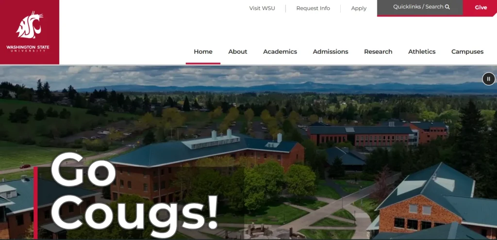
When we take a look at the website of the Washington State University, we come back to the same type of website as the first one in this list. Very typical for universities and colleges is to use their logo color throughout the rest of their website to accentuate the content that is being provided. That’s not really a coincidence though. The logo of the university is usually something students and teachers feel proud of. By showcasing the colors of their logo on their website, they reflect a certain feeling of belonging and pride.
6. Park University

Park University is a nonprofit, private university located in Parkville, Missouri. The university provides graduate and undergraduate degrees, with certain courses being delivered virtually. Park University has created an effective website and homepage. WordPress makes it simpler for the institution’s administration to change information effortlessly, and the theme of the website was specially created for the university to complement its branding well.
7. The Suffern Central

The Suffern Central Located in New York, this school district website acts as a hub for individual school websites, similar to the Round Rock example above. This sort of format is easy to set up with CampusPress if you have multiple schools as part of your campus or district.
8. NC State University

Another university that earned its spot on the list is the NC State University. This university is located in Raleigh, North Caroline. In overall, their website looks clean and consisting of all the needed information. You can notice the same color balance in this website as well; the logo color is the most used color on the website and accentuates and defines what the university is about. With its nine additional pages, it offers the students a complete insight on what one can expect from the university on different aspects.
9. Columbia College

Another website that surely differentiates itself from other university websites is the University of British Columbia. Although it also maintains the logo color throughout the whole website, they also make use of fun animations. While scrolling on their homepage, you’ll also notice that they rather share visual content than written content as other university websites rather prefer. They provide their visitors with two navigations; one focused on what the university offers and one on that puts the focus on the people behind the university and the community feeling.