
Introduction
Key Takeaways for Your Restaurant Website
To compete in 2025, your restaurant website should:
✅ Load quickly (under 3 seconds)
✅ Be mobile-friendly (Google prioritizes mobile-first indexing)
✅ Use SEO-optimized menus (with schema markup)
✅ Include online ordering/reservations (reduces bounce rate)
✅ Showcase high-quality food photos (increases engagement)
12 Creative & Best Restaurant Website Design Examples
1. Noma
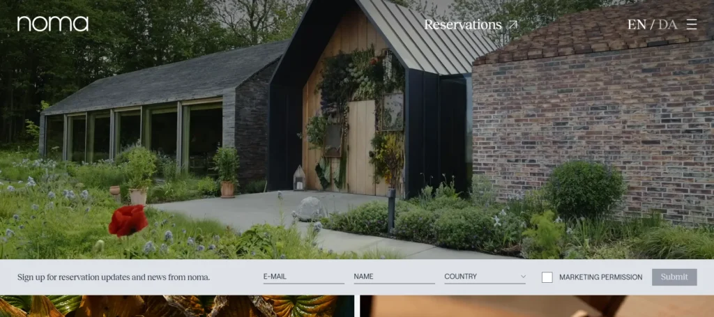
Noma’s website reflects the restaurant’s innovative approach to Nordic cuisine through its bold, immersive design. The homepage greets visitors with dramatic full-bleed photography that changes with the seasons, mirroring the restaurant’s commitment to seasonal ingredients. Scrolling reveals beautifully presented dishes with subtle animations that create a sense of movement and vitality. The color palette of deep greens and earthy tones evokes the restaurant’s connection to nature, while the custom typography adds a distinctive brand identity. The journal section functions as an engaging blog, featuring chef’s notes, behind-the-scenes stories, and culinary philosophy – all excellent for SEO through long-form content and natural keyword integration.
2. The Fat Duck
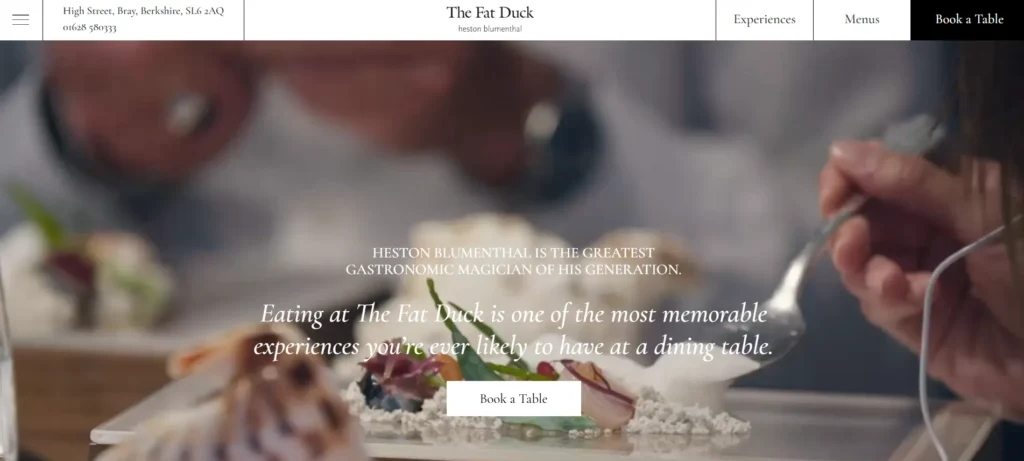
The Fat Duck’s website brilliantly captures Heston Blumenthal’s whimsical, experimental approach to cuisine through its interactive design elements. The homepage features playful animations that engage visitors from the first click, setting the tone for the restaurant’s unique dining experience. A scrolling timeline showcases the restaurant’s history and evolution, while the menu section uses innovative hover effects to reveal additional details about each dish. The color scheme of deep blues and golds conveys luxury and creativity, aligning perfectly with the restaurant’s three-Michelin-star status. From an SEO perspective, the site excels in storytelling content that keeps visitors engaged longer – a positive signal to search engines.
The technical implementation includes schema markup for menus and reservations, enhancing the restaurant’s visibility in specialized search results. Despite the rich media elements, the website maintains strong performance metrics through careful optimization of assets and lazy loading techniques. The virtual tour offers an immersive experience that significantly increases session duration, while the clear calls-to-action for bookings maintain strong conversion rates. Mobile responsiveness is flawless, with touch-friendly navigation and appropriately sized text elements that ensure readability on smaller screens.
3. Osteria Francescana
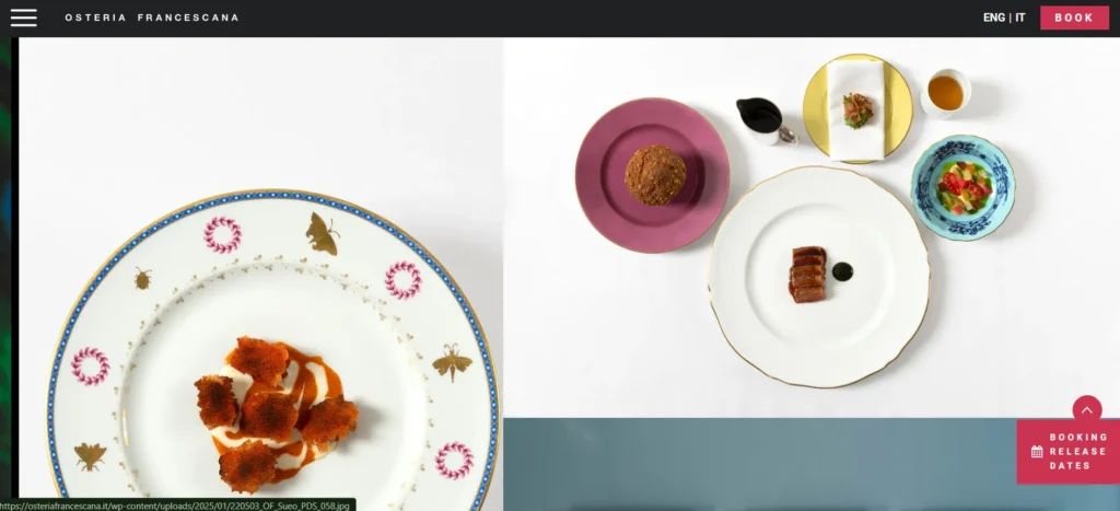
Osteria Francescana’s website reflects Massimo Bottura’s artistic approach to Italian cuisine through its bold, gallery-like design. The black background creates a dramatic contrast that makes the food photography stand out, while the unconventional typography reinforces the restaurant’s avant-garde reputation. The navigation is intentionally minimalist, encouraging visitors to explore the content through scrolling rather than traditional menus. Video backgrounds add movement and depth, showcasing the restaurant’s atmosphere and culinary techniques. For international visibility, the site offers seamless language switching between Italian and English, with content that’s professionally localized rather than machine-translated.
4. Sweetgreen
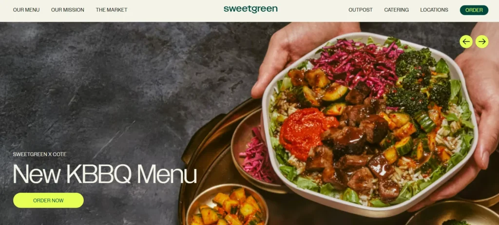
Sweetgreen serving salad bowls is a refreshing change in the junk food era. With a simple color palette, the site displays its prominent salads that focus on health and hygiene. Smartly showing how visitors can connect through their app and its offerings for the corporate client, this one is an example of an excellent web design. With a short video content of salad recipes and the latest news about its achievements, the site captures every eye that falls on it.
5. Franklin Barbecue
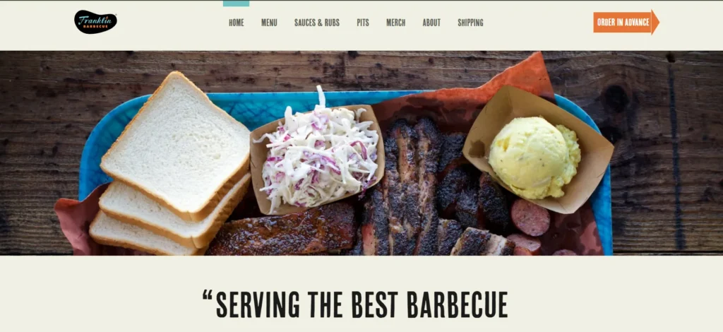
Franklin Barbecue’s website perfectly captures the no-frills, quality-focused ethos of this Austin institution through its straightforward, functional design. The color scheme of deep reds and smoky blacks immediately evokes the restaurant’s barbecue specialty, while the rustic typography reinforces the authentic Texas vibe. The homepage gets straight to the point with essential information: current hours, wait time estimates, and a prominent link to online ordering. The menu presentation is beautifully simple, with high-quality photos accompanying each item description that naturally include keywords like “best brisket Austin” and “Texas-style barbecue.” For local SEO, the site includes detailed location information with an embedded Google Map and clear directions via multiple transportation methods.
The FAQ section addresses common customer questions using natural language that matches voice search queries, while also helping with featured snippet opportunities. Technical performance is excellent, with fast loading times achieved through optimized images and minimal unnecessary scripts. The mobile experience is particularly well-considered, with large touch targets for key actions and text that remains readable on small screens. The merchandise section provides an additional revenue stream while reinforcing brand loyalty, with product descriptions that contribute to the site’s overall keyword diversity.
6. Pujol
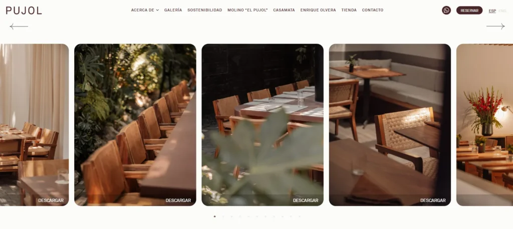
Pujol’s website embodies the refined elegance of Mexico City’s most celebrated restaurant through its moody, sophisticated design. The dark color scheme creates a dramatic backdrop that makes the food photography truly stand out, while the minimalist typography conveys understated luxury. The homepage features a striking video loop that captures the restaurant’s ambiance without overwhelming the visitor. Navigation is intentionally sparse, encouraging exploration through scrolling rather than traditional menus. The tasting menu presentation is particularly effective, with artistic dish photos accompanied by concise descriptions that highlight local ingredients – perfect for both user experience and keyword optimization.
7. Forma
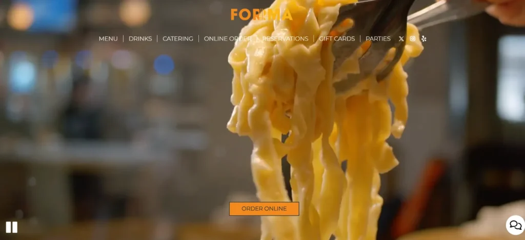
Forma Location-based website design lays stress on the food, location, and marketing info and delivers a message about the origin of the company. Slow-motion videos, a bright color palette, visually stunning pictures, and nicely highlighted reviews, make the design an inspiration for future website makers.
8. Attica
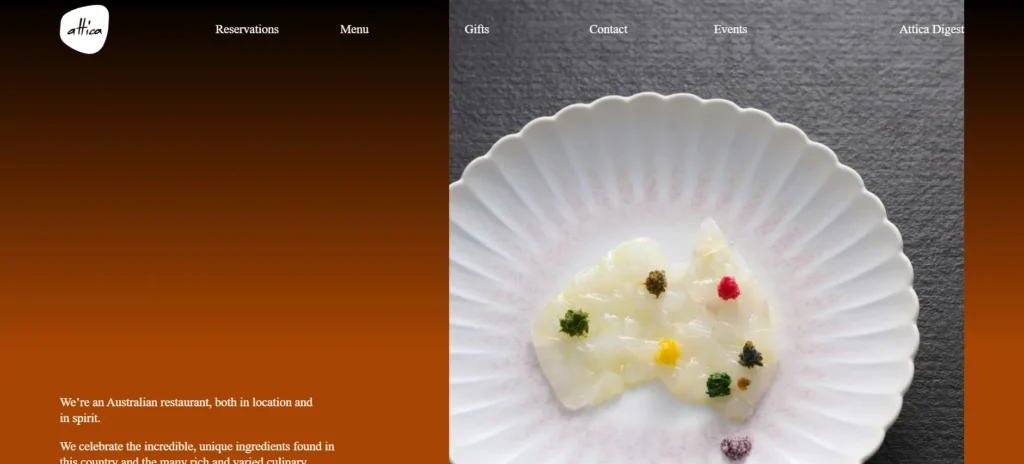
Attica’s website reflects the restaurant’s deep connection to Australian ingredients and landscapes through its earthy, nature-inspired design. The color palette of warm browns and soft greens evokes the Australian bush, while the organic shapes and textures reinforce the restaurant’s commitment to native flavors. The homepage features stunning photography that changes seasonally, immediately communicating the restaurant’s focus on fresh, local produce. Scrolling reveals thoughtful animations that guide visitors through the dining experience without feeling intrusive.
9. Katz's Delicatessen
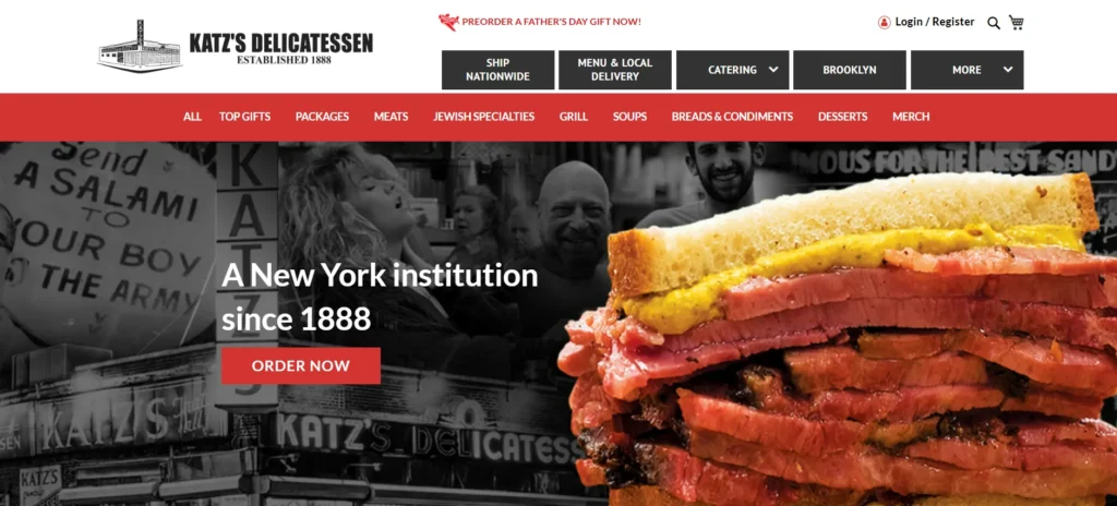
Katz’s Delicatessen website successfully translates the iconic New York eatery’s historic charm into digital form. The design balances nostalgia with modern functionality, featuring vintage photography alongside clear calls-to-action for online ordering and catering. The color scheme of deli-case yellows and classic reds immediately evokes the restaurant’s old-school atmosphere. The homepage prominently features Katz’s famous pastrami sandwich, with mouthwatering photography that dominates above-the-fold real estate – perfect for immediate visual impact and “pastrami sandwich NYC” keyword relevance. The navigation is straightforward, with clear sections for menu, locations, and catering services.
10. Alinea
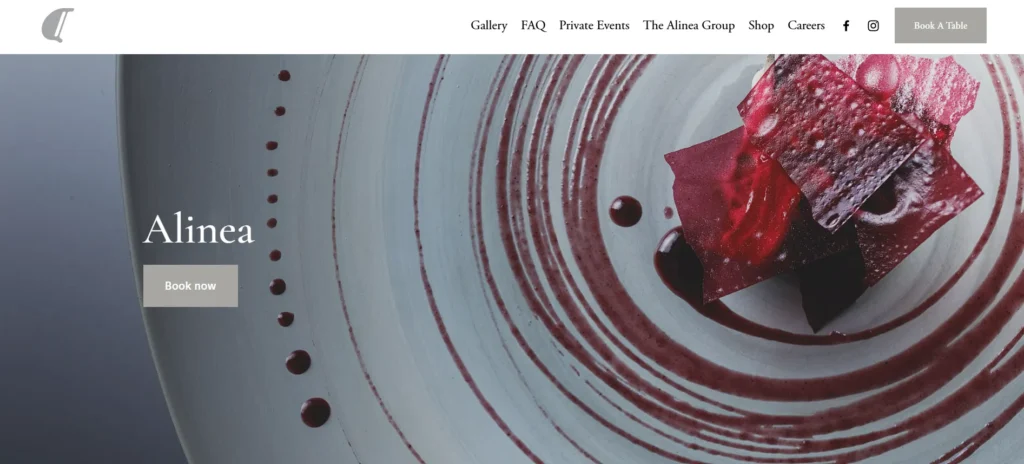
Alinea’s website perfectly captures the restaurant’s reputation for avant-garde dining through its innovative, interactive design. The dark background creates a dramatic canvas for the vibrant food photography, while the unconventional layout breaks from traditional restaurant website conventions. The homepage features dynamic content blocks that rearrange as you scroll, creating a sense of movement and surprise that mirrors the dining experience. Hover effects reveal additional information about dishes and concepts, encouraging exploration and increasing engagement metrics. The reservations system is seamlessly integrated with Tock, providing real-time availability and pricing for different experience tiers. For SEO, the site targets high-intent keywords like “molecular gastronomy Chicago” and “tasting menu restaurant” through naturally integrated menu descriptions and content sections.
11. Black Tap
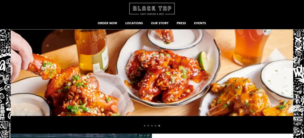
Black Tap’s website brilliantly conveys the fun, energetic vibe of this popular burger and shake chain through its bold, colorful design. The vibrant color scheme of electric blues and bright pinks immediately communicates the brand’s playful personality, while the graffiti-inspired typography reinforces the urban, youthful atmosphere. The homepage features mouthwatering hero images of their famous CrazyShakes and burgers, optimized for both visual impact and keywords like “best milkshake NYC.” Navigation is intuitively organized, with clear sections for menus, locations, and merchandise. The online ordering system is prominently placed and easy to use, with customization options that reduce bounce rates.
12. Zuma
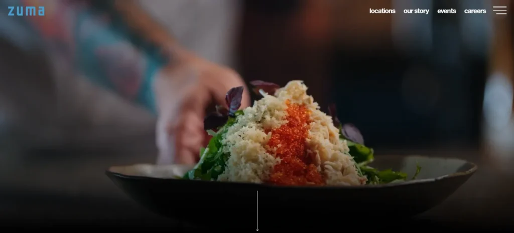
Zuma’s website reflects the global sophistication of this high-end Japanese restaurant chain through its sleek, minimalist design. The black and gold color scheme conveys luxury and exclusivity, while the clean typography ensures readability across all sections. The homepage features stunning photography of signature dishes and restaurant interiors, immediately establishing the brand’s premium positioning. Navigation is intuitively organized with a focus on key conversion points: reservations, private dining, and location information. For international SEO, the site excels with location-specific pages for each outpost, each optimized for local search terms while maintaining consistent global branding. The private dining section is particularly well-developed, with detailed information that targets corporate event planners and special occasion searches.
Conclusion
Frequently Asked Questions
What makes a great restaurant website in 2025?
A great restaurant website combines stunning visuals, fast loading speeds, mobile optimization, easy navigation, and strong SEO. Key features include:
High-quality food photography
Online reservation & ordering integration
Local SEO optimization (Google My Business, location pages)
Blog with engaging content (recipes, chef stories)