
Introduction
In 2025, pharmacy websites are no longer just online brochures. They’re high-performing digital hubs that prioritize user experience (UX), mobile responsiveness, eCommerce functionality, and patient engagement. Whether you’re launching a new digital pharmacy or upgrading an outdated site, this curated list of the best pharmacy website design examples in 2025 will spark ideas and help you stay ahead of the curve.
10 Features Every Pharmacy Website Must Have in 2025
In today’s digital-first healthcare landscape, your pharmacy website is more than just a marketing tool — it’s a central hub for patient interaction, prescription management, and business growth. Whether you’re building a new pharmacy site or revamping an existing one, there are 10 essential features every pharmacy website needs to succeed in 2025. Let’s walk through each one in detail:
1. HIPAA Compliance & Security
Any website that handles patient health information must comply with HIPAA (Health Insurance Portability and Accountability Act). This means your pharmacy site must include secure hosting, data encryption (SSL certificates), and privacy policy disclosures. Protecting user data is not just good practice — it’s a legal requirement. Use HIPAA-compliant forms for prescription refills, consultation requests, and account logins.
2. Mobile-Responsive Design
Over 70% of healthcare website traffic now comes from mobile devices. Your pharmacy website must adapt seamlessly to smartphones and tablets. A mobile-responsive design ensures that users can access prescriptions, chat with pharmacists, or refill medications with ease — no matter the device they’re using. Google also prioritizes mobile-optimized sites in search rankings, making this essential for SEO.
3. Online Prescription Refill System
Convenience is key. An intuitive online prescription refill feature allows patients to reorder medications with just a few clicks. This reduces the burden on your staff and enhances customer loyalty. The best systems offer account login, prescription history, and automatic refill reminders — helping your pharmacy stay efficient and patient-focused.
4. Clear Navigation & User Experience (UX)
A confusing or cluttered website drives users away. Use clear menus, call-to-action buttons (CTAs), and logical page layouts to create a smooth browsing experience. Prioritize key actions like “Refill a Prescription,” “Talk to a Pharmacist,” or “Find a Location” on your homepage. A well-structured UX keeps patients engaged and improves your conversion rate.
5. Trust Signals & Reviews
Your website must establish credibility and trust immediately. This can include displaying pharmacy licenses, logos of health partners, customer reviews, and affiliations with major health systems. Adding patient testimonials, Google reviews, and security badges (e.g., “HIPAA Compliant,” “SSL Secured”) reinforces your legitimacy and professionalism.
6. E-commerce Capabilities (for OTC Products)
If you sell over-the-counter (OTC) medications, vitamins, or wellness products, your site should function as an online store. A fully integrated eCommerce system lets users browse categories, read product descriptions, and complete secure checkouts. Tools like Shopify, WooCommerce, or custom eCommerce platforms can be tailored to meet pharmacy-specific needs.
7. Live Chat or Pharmacist Messaging
Many patients have quick questions that don’t require a phone call. A live chat feature — or a secure “Ask a Pharmacist” tool — helps answer those in real time. This can improve customer satisfaction and reduce call volume. Ensure the messaging system is encrypted and, if needed, HIPAA-compliant for privacy.
8. Health Education Resources
Position your pharmacy as a trusted source of health knowledge by offering blogs, medication guides, FAQ sections, and explainer videos. These not only help your customers but also boost your SEO by adding keyword-rich, valuable content to your website. Patients are more likely to return to a site that informs as well as serves.
9. Online Appointment Scheduling
Whether it’s for a vaccination, consultation, or wellness service, online appointment booking is a must. Integrate scheduling tools like Calendly, Zocdoc, or a custom calendar widget to let users book and manage appointments on their own. Include automated reminders and options to reschedule or cancel.
10. Accessible & ADA-Compliant Design
An inclusive website is an effective one. ADA compliance ensures your site is accessible to users with disabilities, including those using screen readers or needing alternative navigation. Use alt text for images, keyboard-friendly navigation, readable fonts, and high-contrast color schemes. Accessibility not only improves UX but also reduces your legal risk.
12 Best Pharmacy Website Design Examples You Should Check Out in 2025

The Walgreens website has a very classy feel to it, thanks to its blended use of light gray, white and red. The featured categories section was likely the most impactful feature in the homepage of this website. The section for deals they offer helped this site make it into our list of the best layouts for pharmacies. The use of refined icons was a marketing feature we noticed right away. Give some thought to the great design of this pharmacy website when building out your next website.
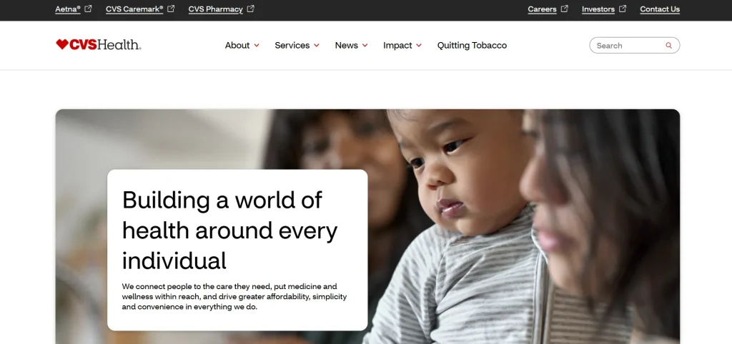
CVS Health is America’s number-one healthcare company that owns pharmacies. A look at the services this company provides through its website shows why they are the preferred choice among Americans. Their services range from mail order pharmacy to prescription delivery amd specialty pharmacy. They even dedicated particular subsites for each service, with each subsite maintaining the same design, brand colors, and company identity. Not to mention ease in ordering, easy navigation, and pleasant online user experience.
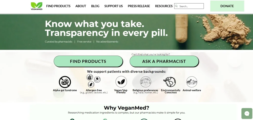
VeganMed is a California-based certified plant-based pharmaceutical brand. This drugstore, in contrast to others, has a website with a unique template that draws customers in right away and speaks for itself. The main attraction is a display of tablets and capsules containing coated and uncoated anti-animal pharmaceuticals with an overlay for targeted drug searches.
The non-sticky bar has features like the Certification and About Us menus, among others. The Certification menu offers social proof in the form of testimonials, but the About page gives you a detailed history of the brand. The imaginative use of bold colors is an incredible element of this drugstore website. Another useful feature is the chatbot pop-up, which allows you to schedule refills and communicate with a pharmacist about first-aid medicines. Another thoughtful element is the pop-up that lets you schedule refills and speak with a pharmacist for first-aid medicines.
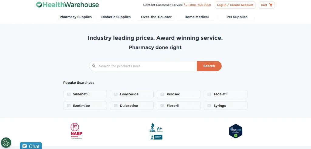
Forbes Health Best of 2023 Awardee HealthWarehouse.Com has an ambient and easy-to-understand website. In addition to the menu, the website provides visitors various means to quickly find the medicines they need. There’s a search button and product catalogue above the menu. Plus, the search option is available throughout the page, too. The minimalist layout and generous white spaces also help visitors find what they need easily.

FaastPharmacy operates as an online pharmacy in California, United States. Unlike the other pharmacies on the list, this one doesn’t have any physical locations. Online ordering allows you to select the medications you want, place your order, and track the delivery. FaastPharmacy’s color scheme lacks distinguishing characteristics, thus it only employs white and blue. And it’s alright.
Since it’s the design of your pharmacy website, you want to keep it simple while still providing all the information for the customers. When you visit a website, you will see a list of potential treatments with a call to action, and the pharmacy will help you select the drugs you need promptly. Furthermore, a site displays the prices for the most popular prescriptions below the fold. Overall, the website image is clear, uncluttered, and fairly positive.
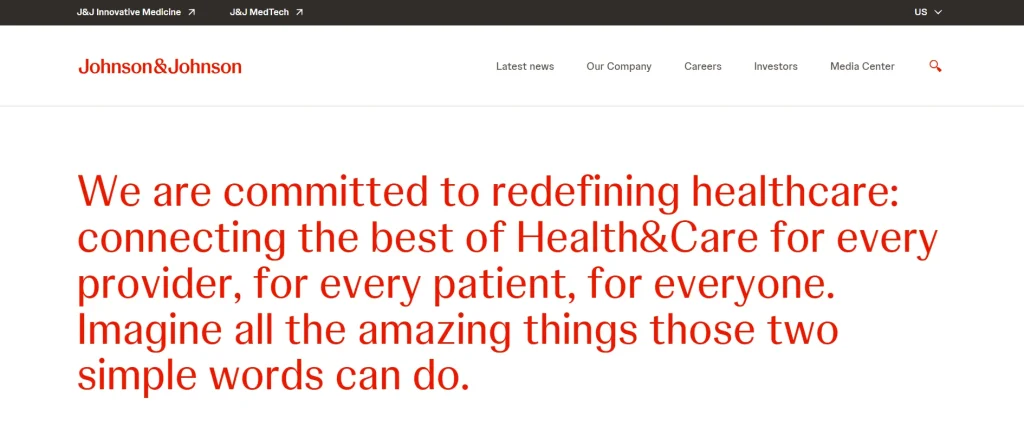
Johnson & Johnson’s website combines a crisp red and white palette with user-friendly navigation. Its interactive features and videos engage visitors, while the organized media center ensures easy access to the latest news, effectively reflecting the company’s commitment to clarity and user engagement.

Merck’s website employs a clean and modern design, utilizing a color palette of teal, white, and black that reflects the company’s brand identity. The website’s clear layout makes it easy for visitors to quickly find the information they need. Noteworthy is the site’s emphasis on imagery, which adds a dynamic and engaging element to the user experience. The menu is straightforward, offering quick access to crucial sections. The buttons and other interactive elements are strategically placed for enhanced visibility.

Progress Pharmacy is among the most beautiful pharmacy website designs on the list. They have created a website design in such a way, that they can elevate the customer experience of obtaining clinical treatment with their recent improvements. Progress Pharmacy has positioned itself as a dependable neighborhood pharmacy tailored to meet individual needs and preferences. Their website showcases simplicity yet sophistication, boasting an expensive and organized vibe that captivates visitors.
What sets its design apart is its clear intention, effortlessly accommodating the needs of users seeking information or services. The typography on the website is also worth looking at, which piques attention and guides visitors through the content with clarity and ease. For those seeking a seamless and visually appealing pharmacy website experience, Progress Pharmacy’s design sets a standard of excellence, offering both aesthetic appeal and user-centric functionality.

New to the list is Haleon, a bit more risque on the design side but that is what we like about it. As opposed to the cold and corporate look most pharma companies opt for, this site is a welcome respite with bold branding, dynamic video within the hero section, and an interesting play on the “e” in the logo throughout the site. It maintains the storytelling aspect of modern pharma sites, but includes some product elements that no doubt drive some awareness to items you probably have in your medicine cabinet.
In contrast to many other pharmacy websites, this particular one has made a unique and right choice by featuring testimonials, providing visitors with real feedback about the quality of their service. Testimonials serve as powerful tools for building trust, as they are delivered in an unbiased manner and showcase genuine experiences from satisfied customers. Moreover, visitors to the website can find information quickly and effortlessly, thanks to its user-friendly design that prioritizes ease of navigation.
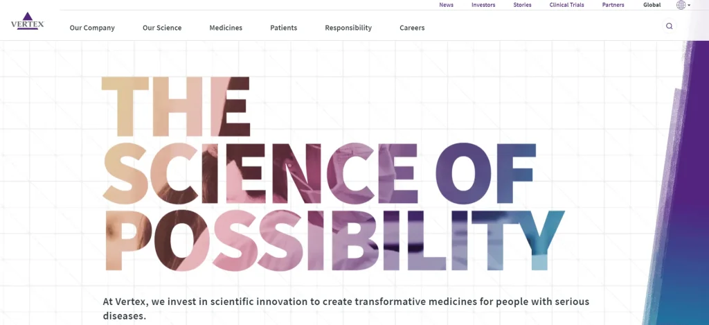
Vertex Pharmaceuticals’s website features a modern design that highlights their innovative cystic fibrosis treatments and commitment to patient well-being. The site stands out with a background video behind the header text, adding a dynamic touch. It’s also easy to navigate, offering interesting content from start to finish.
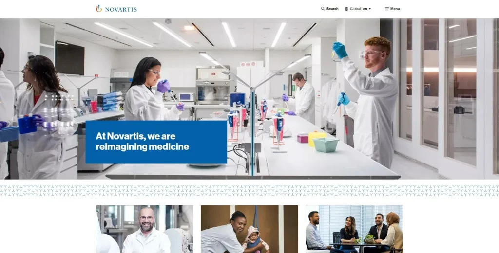
Novartis’ website features a user-friendly interface with clear navigation, showcasing the company’s commitment to transforming patients’ lives through innovative medicines and cutting-edge research.
Conclusion
In 2025, a modern pharmacy website must be fast, secure, user-friendly, and optimized for both desktop and mobile users. The best designs emphasize: Clear CTAs, Integrated eCommerce, Real-time features like delivery tracking, Patient portals and chatbot support, HIPAA compliance and trust signals. If you’re building or revamping a pharmacy website, use these examples as your blueprint — and don’t forget to partner with a design team that understands both UX and healthcare compliance.
Frequently Asked Questions
What are the top trends in pharmacy website design in 2025?
- AI-powered search and chat
- Real-time delivery updates
- Integration with health apps and wearables
- Personalized medication dashboards
Which platform is best for a pharmacy website?
Webflow, WordPress (with HIPAA plugins), and Shopify are popular for custom designs and ease of use.
Is it necessary to be HIPAA compliant?
Yes. If you’re collecting any personal health information (PHI), HIPAA compliance is a legal requirement in the U.S.